EmailBoutique

For review · Screenshot tour

Inside the Email Design System Starter.

EmailBoutique’s master Figma file for email design systems, shown page by page through screenshots and short notes. The Figma file itself isn’t shared here. It’s shown in a live tour.

  • 13 pages
  • 71 components, all Ready
  • 13 component groups
  • 16 email templates
  • Light + dark modes
  • 600–700px layout modes

Also in this tour: how the file is built, how the tokens connect and what a rebrand takes ↓

Follow the stepsUse the list on the left, or the Next links at the end of each step.
Open any screenshotClick or tap an image to see it full size.
Note what you thinkEach step ends with questions. The last section explains how to send feedback.
01Cover

The Starter at a glance

The cover sets the intent: a neutral starting point that gets re-themed for each brand, never used as-is.

Cover page🎀 Cover
02Read me · Documentation

Four steps to a new brand system

Every client build follows the same four steps: duplicate the file (one copy per brand), re-theme colour, type and logo, pick an email width from the Layout modes, then build emails from the components.

The page bar at the bottom of every page header links every page, from Documentation to Tools, so nobody gets lost in a large file.

Read me page header👋 Read me
Look for
  • Is the setup order clear for someone new to the file?
  • Do the page names tell you where to find things?
03Foundations · Colour

Three layers of colour tokens

Primitives hold the raw values and are hidden from colour pickers. Color holds semantic tokens with a Light and a Dark (dark-mode email) value. Surface holds section-level tokens with White, Subtle and Dark values, so any module can sit on any section and its text, links and buttons flip automatically.

Re-theming a brand means changing the primitives or the aliases; every swatch and component follows.

Live demo · token cascade

gray/900color/button/primary-bgsurface/button/primary-bg
Header
ShopSale
ButtonShop the collection
CardCard titleRead more

Pick a colour. It changes once, at the top of the chain, and every component that reads the surface token follows. Simplified example with one chain.

Colour page, top section. The full token set is shared in a live tour.🎨 Foundations › Colour
Look for
  • Are the token names easy to understand?
  • Is the split between Color and Surface clear?
04Foundations · Typography

Web fonts, fallbacks and one H1

Font tokens pair each web font with an email-safe fallback, so a frame can be switched to Fallback to preview the email where web fonts don’t load, such as Outlook for Windows. The type scale has Desktop and Mobile values, and every text style is bound to it.

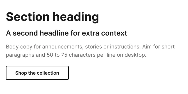
One rule runs through the whole file: one H1 per email, always the biggest heading.

Typography🎨 Foundations › Typography
05Foundations · Layout

A 12-column grid with one gutter

Every block snaps to 12 columns with one gutter that stays the same at every email width, on desktop and on mobile. Each email width (600, 620, 640, 660, 700) is a mode of the Layout collection, so changing the width of an email is one switch. Every value is an even number.

Email Grid Calculator: work out column widths, padding and gutters for any email width (opens in a new tab)

A padded row at 600, one of the five widths below🎨 Foundations › Layout
The same 12-column grid in every Layout mode
Email widthSide paddingContentColumnGutter
600245522424
620225762624
640206002824
660186243024
700266483224
Mobile243724 columns24
06Foundations · Accessibility

Contrast checked on every surface

Every text and button colour pair is checked on each surface (White, Subtle, Dark) in both colour modes against WCAG 2.1: 4.5:1 for text, 3:1 for large text, button outlines and icons. The previews are live, so the check is re-run after a brand is re-themed. In the neutral Starter, all 42 pairs pass.

Accessibility · contrast check🎨 Foundations › Accessibility
07Brand assets

Logos, icons, badges and graphics

The logo comes in every version and tone (primary, wordmark, monogram, partner lock-up) with a slot for the brand’s artwork. UI icons, list and progress markers, social icons, app store badges and decorative graphics are components too. Each group has a dark preview, so assets are checked in dark mode before they ship.

Brand asset groups🏷️ Brand assets
08Image library

Approved photos, cropped once

Photos live in five collections: Product, Lifestyle, People, Places and Seasonal. A photo is placed once and the Photo component crops it to the six image ratios. Alt text, credit, licence end date and dark-mode notes sit in each photo’s description.

Photo collections🖼️ Image library
09Grid blocks & specs

Every layout, measured

Column skeletons for one to four columns, icon rows and nested layouts. Each variant has a desktop and a mobile spec card with the widths, gaps and padding labelled and bound to the layout tokens, plus the source component below it. Rows of three always stack on mobile.

Block / 3 columns. Toggle the EmailBoutique Grid overlay: side padding in yellow, columns in turquoise📐 Grid blocks & specs
Look for
  • Could a developer build the block from the spec card alone?
10Components · Component index

71 components, organised by where they sit

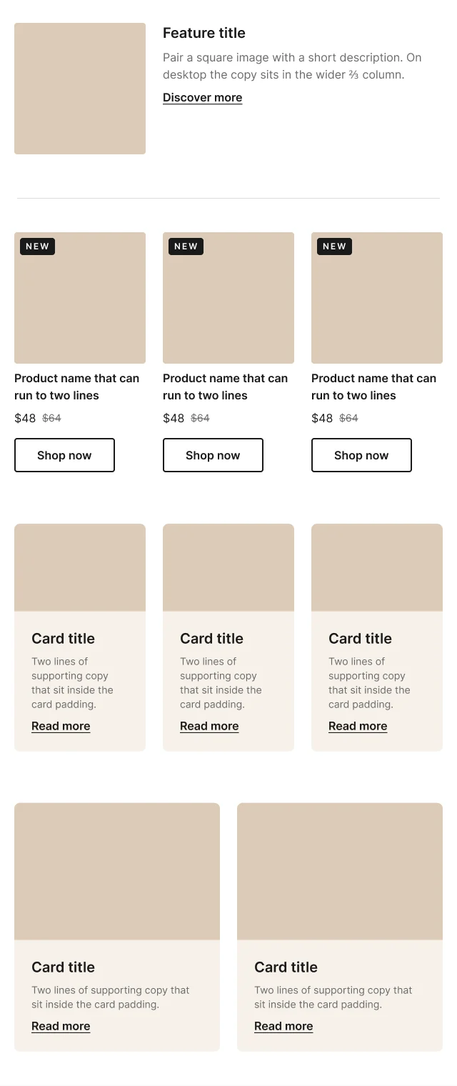
The Components page opens with the recommended order of an email, from inbox to footer, and groups every component the same way. Each component has Desktop and Mobile variants, a written description, a status badge and a dark preview. The Component index lists every component with the email types and industries it suits, so it can be found by search.

Live demo · component assembly

HeaderHeroIntro: text blockContent: image and text split, product row and card rowsFooter: super footer and footer

The real Starter email, cut at its component boundaries. Click a section to see it in place.

Recommended email sections🧩 Components
Hero group🧩 Components › Hero
Building blocks 5Button, Divider, Spacer, Surface modes, Card
Inbox 2Subject line + preheader, Preheader
Header 3Header, Promo bar, Progress steps
Hero 3Hero, Hero overlay, Image collage
Intro & copy 6Greeting, Copy block, Text block, Letter, Section label, Dynamic content
Content 13Image + text split, card rows, lists, steps, stats, key facts, video, downloads, choice cards, category links, store card
Commerce 14Product cards, rows and grids, featured product, pricing, offer tiers, promo code, countdown, product alert, comparison table, referral
Events 7Event, event list, date chips, weekly schedule, speakers, add to calendar
Transactional 6Order line item, order summary, order status, security code, loyalty status, gift card
Social proof 5Quote, Rating, Trust strip, Social gallery, NPS survey
Interactive 3Accordion, Carousel, Hotspots, each with a static fallback
Banners 2Image banner, App promo
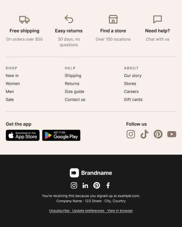
Footer 2Super footer, Footer

Look for
  • Is anything missing that your emails need?
  • Do the component descriptions answer your questions?
11Email rules · Handoff map

From design to code

The Email rules page collects what every email has to respect: dark mode, Outlook for Windows, Gmail and webmail, images, accessibility, component code notes, file weight, animated GIFs, dark-mode assets and a QA checklist to run before every send.

The Handoff map pairs every Figma component with the block that builds it in the EmailBoutique Denada library and the HTML pattern a developer uses, marked Direct, Partial or New.

Dark modeOutlook for WindowsGmail and webmailImagesAccessibilityComponent code notesFile weightAnimated GIFsDark-mode assetsQA checklist

Live demo · from Figma to Denada

Figma doesn’t generate the code. Each coded block is hand-built to match its Figma component and tested in real inboxes. Code shortened for the demo.

Handoff map, first rows. The full map is shared in a live tour.🌗 Email rules › Handoff map
12Starter email

A full email, built from instances

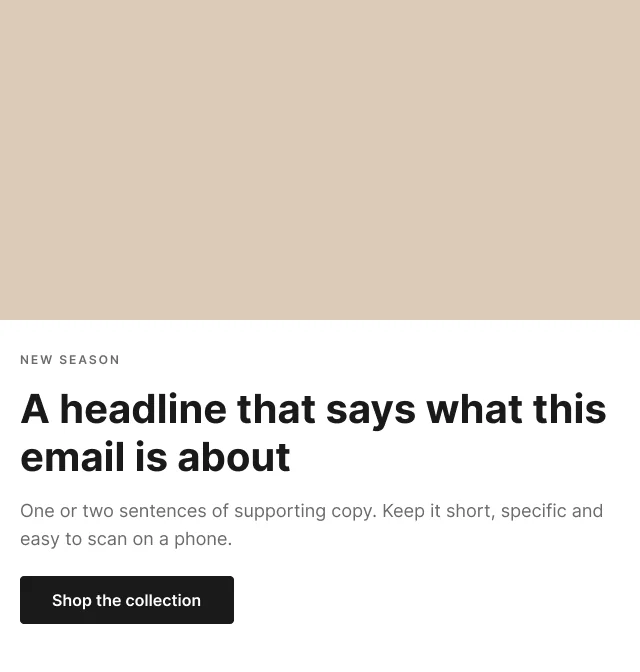
The Starter email assembles the components into a complete email in desktop and mobile. Rows stack on phones, photos run full width and cards keep equal heights. The Appearance switcher shows the same email in light and dark mode, as Apple Mail and other full-support clients render it.

Sixteen templates cover common emails: newsletter, promo, welcome, order and shipping confirmation, event invite and reminder, abandoned cart, back in stock, re-engagement, password reset, letter, membership renewal, fundraising appeal, course onboarding and app download, plus recipes by industry.

Live demo · light and dark

The two designed states from the Figma file. In real inboxes, dark mode depends on the email client: some use the designed dark colours, some invert colours on their own, some don’t change anything.

DesktopStarter email / Desktop
MobileStarter email / Mobile
Light and darkAppearance switcher
Look for
  • Does the mobile version read well without zooming?
  • Does dark mode keep the hierarchy clear?
13Changelog

A system that keeps improving

The Starter is the source of truth for every client file. Improvements found during client builds go into an Inbox, then get promoted to the Starter as a new version. Each client file notes which Starter version it started from.

v1.2the Starter as the source of truth
  • 12-column grid with one gutter, 4-column mobile
  • Brand assets, Image library, Component index and Tools pages
  • Components organised by email section, all Ready, with dark previews
  • Handoff map to the Denada library
v1.1promoted from a client build
  • Label font role, button tokens, Light and Dark tone on Header and Footer, new surface tokens
v1.0first release
  • Tokens, grid, core modules in desktop and mobile, email rules
14Tools

Tools that work with the file

Two Figma plugins keep the spec labels in sync and add email grids to frames. Both are in review with Figma and not available yet. Web and open-source tools cover grid planning, dark-mode previews, pre-send HTML QA and full-page email screenshots.

01

Sync spec labels

Figma plugin · Free · In review Not available yet

Keeps this file in step with itself. Three tabs: Spec labels copies every layout and spacing number into its printed spec label; Dark previews adds new components to their group’s dark preview; Page menus rebuilds the menu in every page header from the page order. In review with Figma, not available yet.

Use it whenRun it after changing a grid or spacing value, adding or removing a component, or adding, renaming or moving a page.

02

Email Grid for Figma

Figma plugin · Free · In review Not available yet

Adds EmailBoutique email grids to your Figma frames, or creates a desktop email frame and a matching mobile frame side by side. Paste a settings code from the Email Grid Calculator or enter values by hand; save grids as reusable layout grid styles. No network access: it only works inside the open file. In review with Figma, not available yet.

Use it whenStarting a new email width or layout, or checking that a design sits on the grid.

03

Email Grid Calculator

Web tool · Free

Works out every column, split, image export size and mobile width for an email grid before you set it up in Figma. Copy the result as a settings code for the Figma plugin.

Use it whenPlanning a width or grid for a new client (600, 620, 640, 660 or 700).

04

Dark-Mode Preview

Web tool · Free

Paste an email and see all three dark-mode cases (no change, partial invert, full invert) with a contrast score on each.

Use it whenChecking logos, icons and text colours before a send, alongside Foundations › Dark mode images.

05

Email HTML QA

AI skill · Open source

An agent runs 40+ pre-send checks on the raw HTML and flags the exact line: links, alt text, accessibility, dark mode, Outlook and file weight.

Use it whenBefore every send, together with the QA checklist on the Email rules page.

06

Email Screenshot Tool

Desktop tool · Open source

One email in, four full-page PNGs out: desktop and mobile, light and dark.

Use it whenSharing a design for review, or adding finished emails to a portfolio or case study.

07

Keep learning

Course · Newsletter · Talks

The Email Design Course (coming soon) covers building resilient email design systems: dark mode, accessibility and the AI-assisted workflow. The Margin is a newsletter about email, work and what’s being built. Talks and articles go deeper on dark mode, QA and the email production process.

Use it whenYou want the thinking behind this system.

Part 2

How the Starter is built

Every colour, font, size, space and width in the file is a variable. Components never hold raw values; they point at tokens, and tokens point at each other. Change a value once and every component, template and spec that uses it follows.

15How it’s built · The numbers

Counted from the file

186variables in 7 collections
84components, with 358 variants
5,071layers bound to variables
24grid styles bound to Layout

Counted directly from the Figma file. 5,071 of the 7,908 layers inside the components are bound to a variable; the rest are containers and artwork slots.

16How it’s built · File structure

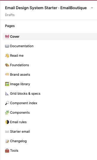
Thirteen pages, in the order you use them

The pages run from orientation to foundations, building, shipping and maintenance. Every page header repeats the same numbered page bar, so any page is one click away.

Figma pages panel of the Email Design System Starter file listing 13 pages from Cover to Tools.
Pages panel in Figma

Start

  • 🎀 CoverName, version and what the kit includes.
  • 📖 DocumentationWhat each page is for, with a link to every section.
  • 👋 Read meSetup in four steps, variables, grid and spacing rules, component status.

Foundations

  • 🎨 FoundationsColour, typography, spacing, layout, images, dark-mode images, accessibility.
  • 🏷️ Brand assetsLogo in every version, icons, social icons, app badges, graphics.
  • 🖼️ Image libraryApproved photos in five collections, cropped to six ratios.

Build

  • 📐 Grid blocks & specsColumn skeletons with desktop and mobile spec cards.
  • 🔎 Component indexEvery component with its group, email types, industries and search words.
  • 🧩 Components71 email modules in 13 groups, desktop and mobile.

Ship

  • 🌗 Email rulesInbox behaviour, code notes, QA checklist and the Figma → Denada handoff map.
  • ✉️ Starter emailA full email, 16 templates and recipes by industry.

Maintain

  • 📝 ChangelogStarter versions and the inbox of improvements from client builds.
  • 🧰 ToolsPlugins and tools that work with the file.
17How it’s built · Asset library

Every component, ready to drag in

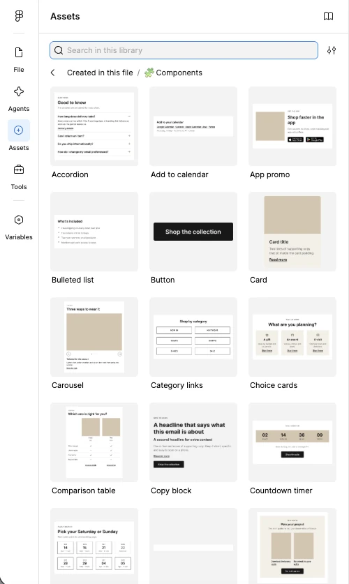
  • All components appear in Figma’s Assets panel with a live thumbnail, from Accordion to Video, so building an email is a matter of dragging modules in order.
  • Each component carries its usage notes in its description, so the guidance shows up where the designer picks it.
  • Dropped-in modules are instances. A fix to the main component reaches every email and template that uses it.
  • Logos, icons, badges and photos from Brand assets and the Image library sit in the same panel, so brand artwork is placed once and reused.
  • The Component index adds email types, industries and search words, for finding the right module by what the email needs.
Figma Assets panel showing the Starter components with thumbnails: Accordion, Add to calendar, App promo, Bulleted list, Button, Card, Carousel, Category links, Choice cards, Comparison table, Copy block, Countdown timer.
Assets panel in Figma
18How it’s built · The token chain

How all tokens are connected

Values flow from left to right. Raw values live in a few collections; semantic tokens alias them; text and grid styles bind to them; components use only the semantic layer. Pick an example to trace one value through the file.

Raw values
Primitives 21Greys plus warm placeholder and status colours. Hidden from pickers; re-theme here first.
Value
Font 10Heading, body and label families, stacks, weights and the import URL.
Web fontFallback
Typography 22Size and line height for every text style.
DesktopMobile
Spacing 30Even spacing scale, named rules, radius and button tokens.
Value
Layout 46Container, side padding, 12 columns and spans, gutter, mobile canvas.
600620640660700
Semantic
Color 20bg, text, link, button and border roles, each with a light and a dark-mode value.
LightDark
Surface 13Section-level roles, so a module can sit on any section and its text flips.
WhiteSubtleDark
Styles
Text styles 10H1–H4, Body large, default and small, Eyebrow, Button, Link and Legal, all bound to Font and Typography.
Grid styles 24EmailBoutique Grid, desktop and mobile, padded and flush, bound to Layout.
Output
Components 84358 desktop and mobile variants. Use Surface, Spacing, Layout and the text styles only.
Templates 16Plus the Starter email and Appearance switcher, built from component instances.

Numbers on the lines are alias links counted in the file: Color points at Primitives 40 times (20 tokens × Light and Dark), Surface points at Color 26 times and at Primitives 13 times. The colour and font libraries themselves are in steps 03 and 04.

19How it’s built · Architecture

Change the values, not the components

A new brand doesn’t mean redrawing components. It means editing a short list of values; the bindings do the rest.

  1. Duplicate the StarterOne copy per brand, noting the Starter version.1 file
  2. Set the brand coloursReplace the raw colours in Primitives. Color and Surface follow, in light and dark.21 primitives
  3. Set the fontsHeading, body and label families, their fallback stacks and the import URL.7 font values
  4. Set the shapeButton and card corner radius.2 radius tokens
  5. Pick the email widthSwitch the Layout mode to 600, 620, 640, 660 or 700. Grid, specs and blocks re-flow.1 mode switch
  6. Drop in the logoPlace the artwork once in the Logo component; every header and footer uses it.1 logo slot
  7. Check contrastReview the live Accessibility page and adjust any pair that falls below AA.42 pairs checked

What those edits update in v1.2

31values edited by hand
5,071bound layers update
358component variants re-themed
16templates, desktop and mobile, light and dark

These are today’s counts. Every component and template added to the system joins them, and re-themes with the same edits.

Brand-specific components, photography, copy and email QA are separate from the token rebrand and are scoped for each brand.

Screenshots of the EmailBoutique Email Design System Starter v1.2, shared for review only. The file, its components and its documentation are © EmailBoutique Digital Inc. and are not licensed for reuse. Annett Forcier — Digital designer and developer.

Give feedback